Many people have heard of the “Pareto Principle.” This is a statistical phenomenon where 80% of the results are produced by 20% of the individuals. This result is found in many areas. As far as I can tell, there does not seem to be an effort to understand why this phenomenon occurs. The Pareto Principle is the result of a “Pareto Process” that generates a nonlinear cumulative distribution function.
I discovered a possible explanation for the Pareto Process using “data pattern analysis,” which is a method of pattern matching. The patterns generated by the Pareto Process appear to be caused by between and within individual variation in levels of chaos. As the level of propensity to act increases, so does the level of chaos.
In searching for attempts to explain the Pareto Process, I find that the current explanations are different from my approach. The Pareto Distribution is plotted at the individual level. If my solution is correct, the current approach is not likely to produce an explanation, because the explanation involves looking at the problem from the outcome level.
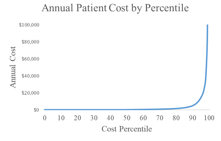
The following plot shows the distribution of average annual patient cost by payment percentile. You will notice that this distribution is backwards from the Pareto Distribution that is being used as the current conceptual model. This plot does not fit any formula that I have been able to find. It is a cumulative distribution of accumulated medical cost. In the data underlying this plot, the top 2% of the patients generate 80% of the total dollars spent on patient care. What causes this?
I began my analysis with a presumption that I needed to look at both within and between individual variation. Some people had more chaotic health problems generating greater within individual variation. That is, they weren’t in the hospital for a year. However, they were in and out of the hospital and using health services over the year at a fluctuating rate.
The patients also had between individual differences in health. They had a normally distributed “propensity” for health. The trick was to find a model that used the facts related to within and between individual variation in order to explain how the cost distribution shown above was created.
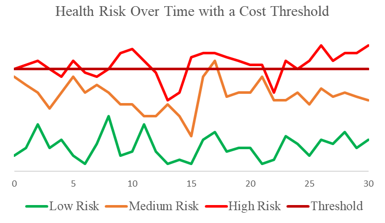
The following plot shows my first hypothesis. I first assumed that there was a threshold for health spending. People in good health are not using healthcare resources. I assumed that there were between individual differences in health level. I then assumed that within individual fluctuation in health was fairly similar between individuals. When health levels deteriorated for an individual beyond the threshold level, they started spending money on health care. Because of both between and within individual variation in health over time, people with poor health (high risk) were spending money on health care more often than people with medium risk, who were spending more money than people with good health (low risk).
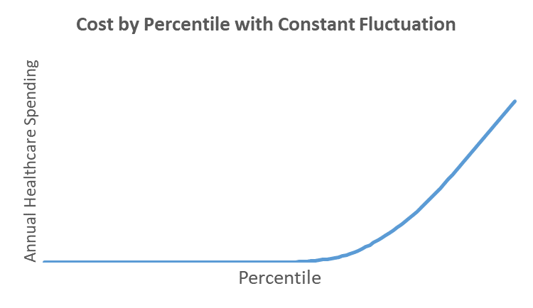
When I added up the health costs by percentile for a population of patients fitting the model shown above, I got the distribution shown below. This is lacking the sharp bend that is characteristic of actual healthcare spending by percentile. Something was missing.